Gene Co-Expression Analysis with WGCNA
Introduction
Weighted Gene Co-Expression Network Analysis (WGCNA) is a systems biology method used to identify clusters (modules) of highly correlated genes across samples. These modules often represent groups of genes that share biological functions, regulatory mechanisms, or participate in similar pathways.
In OmicsBox, the WGCNA workflow allows you to construct gene networks, detect co-expression modules, and explore their relationships with experimental traits or phenotypic variables. The analysis also enables the identification of key genes within modules, such as hub genes, which may play central biological roles.
WGCNA analysis is based on gene expression similarity and follows these main steps:
-
Correlation Calculation. Pairwise correlations are computed between all genes to quantify similarity in their expression profiles across samples. Genes with similar expression patterns are considered co-expressed.
-
Soft-Thresholding Power Selection. Correlation values are transformed into connection strengths using a soft-thresholding power. This parameter controls how strongly high correlations are emphasized while preserving continuous (weighted) relationships. The power is chosen to approximate a scale-free network topology, a common property of biological networks.
-
Network Construction. The correlation matrix is converted into an adjacency matrix, where connection strengths represent the degree of co-expression between genes. This results in a weighted gene co-expression network.
-
Module Detection. Genes are grouped into modules using hierarchical clustering based on network similarity (typically topological overlap). Modules correspond to clusters of highly co-expressed genes.
-
Module Summarization. Each module is summarized by its eigengene, defined as the first principal component of the module’s gene expression matrix. The eigengene represents the overall expression profile of the module.
-
Hub Gene Identification. Genes with high module membership (strongly correlated with the module eigengene) can be identified as hub genes, which may play central biological roles.
-
Module–Trait Relationships. Module eigengenes can be correlated with experimental traits or phenotypes to identify modules associated with biological or experimental variables.
This section describes how to configure and run a WGCNA analysis in OmicsBox, interpret the results, and visualize gene co-expression networks.
Please cite WGCNA as:
Langfelder, P., Horvath, S. WGCNA: an R package for weighted correlation network analysis. BMC Bioinformatics 9, 559 (2008). https://doi.org/10.1186/1471-2105-9-559
Run Gene Co-Expression Analysis
The tool is available in transcriptomics > Gene Co-Expression Analysis.
Input
- Count Table. Text file with columns separated by tab containing samples in columns, genes in rows and gene expression levels in values.
- Provide Experimental Design. Check this option to provide an experimental design. It will be used to associate experimental conditions with co-expressed gene modules.
- Experimental Design File. Select your .txt file containing your experimental factors with the experimental conditions associated with each sample in tab-delimited format. As shown below, rows correspond to samples and columns to experimental factors. Make sure that the names in the first column of the experimental design table are exactly the same as the sample names in the count table header.
- Factors to Test. The conditions from the selected factors will be tested for correlattion with the gene modules.
Name    Strain
SRR3666079  FA1090
SRR3666080  FA1090cpxA
SRR3666081  FA1090cpxR
SRR3666082  FA1090
SRR3666083  FA1090cpxA
SRR3666084  FA1090cpxR
SRR3666085  FA1090
SRR3666086  FA1090cpxA
SRR3666087  FA1090cpxR
SRR3666088  FA1090
SRR3666089  FA1090cpxA
SRR3666090  FA1090cpxR
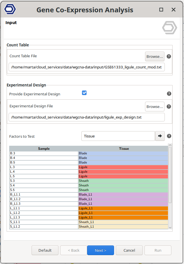
Figure 1. Input wizard page.
Configuration 1: Data Cleaning.
Filtering genes and samples prior to network construction improves the quality and interpretability of the WGCNA analysis.
Genes with low variability across samples typically contribute little information to co-expression analysis. These genes often represent background noise or constitutively expressed genes that do not capture meaningful biological differences. Retaining only highly variable genes helps focus the analysis on the most informative expression patterns, reduces noise, and improves module detection.
Similarly, samples with a large number of missing or non-expressed genes can negatively affect correlation estimates and network stability. Filtering out low-quality samples ensures more reliable co-expression relationships and prevents biased results.
OmicsBox provides the following filtering options:
Gene Filtering
-
High Variable Genes Method. Defines how highly variable genes are selected.
- Elbow Point. Automatically determines the optimal number of highly variable genes. Genes are ranked by decreasing variability. The algorithm identifies the point where the variability curve flattens (the “elbow”), indicating that additional genes contribute minimal new information. Genes beyond this point are excluded.
- Top N Genes. Genes are ranked by decreasing variability, and only the top most variable genes are retained. The number of genes to keep is defined by the N. High Variable Genes parameter.
-
N. High Variable Genes. Specifies the number of genes to retain when using the "Top N Genes" method.
Sample Filtering
- Minimum Genes. Defines the minimum number of expressed genes required for a sample to be included in the analysis. A gene is considered expressed if its expression value is greater than zero. Samples not meeting this threshold are removed.
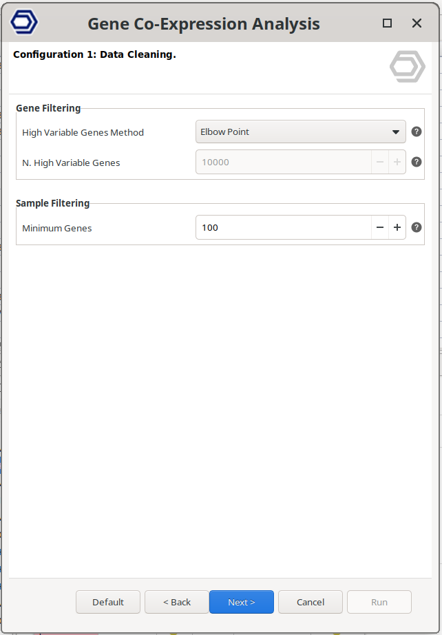
Figure 2. Data cleaning wizard page.
Configuration 2: Module Detection.
This step identifies groups of co-expressed genes (modules). As described in the introduction, WGCNA first calculates gene–gene similarity distances, constructs a weighted network, and then applies hierarchical clustering to detect modules. For a detailed explanation of the underlying methodology, refer to the Gene Co-Expression Analysis with WGCNA introduction section.
Network Construction
- Network Correlation Statistic. Specifies the method used to calculate gene–gene similarity distances. Pearson correlation is the standard choice, while Biweight Midcorrelation (bicor) provides increased robustness to outliers.
- Power Calculation. Select how the soft-thresholding power is defined. Choose 'Automatic' to estimate the optimal value, or 'Manual' to specify a fixed value. See 'Power for Soft Threshold' for additional details.
- Power for Soft Threshold. Defines the soft-thresholding power used to transform gene similarity distances into network connection strengths. Higher values emphasize strong correlations and suppress weak ones, reducing noise but potentially removing weaker biological relationships.
- Network Edge Threshold. Defines the minimum connection strength required for gene–gene relationships to be retained in the network. Connections below this threshold are excluded from visualization.
Module Detection
- Module Detection Sensitivity. Controls how sensitively modules are defined from the clustering tree. Higher values result in a larger number of smaller modules.
- Detect Cut Height. Specifies the maximum cut height used to define modules from the clustering dendrogram. Higher values typically produce more modules with fewer genes.
- Merge Cut Height. Defines the dissimilarity threshold for merging similar modules. Lower values enforce stricter merging. For example, a value of 0.15 merges modules with approximately 85% similarity.
Module Filtering
- Minimum Module Size. Modules containing fewer genes than the specified value are discarded.
- Min Module Connectivity. Modules are discarded if they don't contain enough genes (given by 'Min N. Genes with Min Connectivity) with at least this correlation to their module eigengene.
- Min N. Genes with Min Connectivity. Specifies the minimum number of genes with at least 'Min Module Connectivity' required for a module to be retained.
Correlation Analyses
- Correlation Statistic. Specifies the correlation method used when evaluating relationships between modules, between modules and traits, and between genes and traits.
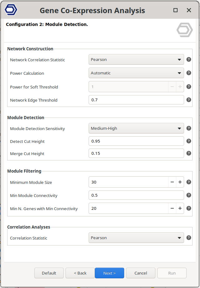
Figure 3. WGCNA configuration wizard page.
Results
Main Results Viewer
The Main Viewer displays the primary results of the WGCNA analysis in a table format (Figure 4). Each row represents a single gene. Only genes that passed the filtering steps are included.
Each gene is assigned a module tag, indicating the co-expression module to which it belongs. In WGCNA, modules are identified using color labels; OmicsBox follows the same convention. Genes assigned to the grey module were not significantly associated with any co-expression module and are therefore grouped separately.
Genes may also receive a hub tag. A gene is considered a hub gene if it shows strong association with its module, defined by a Module Membership (MM) value ≥ 0.8 and a p-value < 0.05. These thresholds can be adjusted in the Side Panel.
The Module Membership (MM) measures how strongly a gene’s expression profile correlates with the module eigengene. It is the correlation between the gene and the module eigengene. The column P-value indicates the significance of the correlation. The module eigenge corresponds to its first principal component. In other words, a module's eigengene summarizes the overall expression of a module. Thus, higher MM values indicate that the gene is more representative of the module’s overall expression pattern.
If an experimental design is provided, additional columns are displayed for each condition. These columns report the correlation between gene expression and the experimental condition, and the corresponding p-value of the correlation. These metrics help identify genes associated with specific biological or experimental variables.
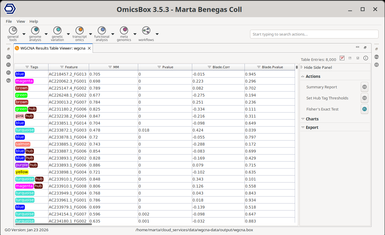
Figure 4. WGCNA Main Results table.
Side Panel
Actions
Summary Report
Generates a summary of the analysis results (Figure 5).
The Results Overview section provides key information about the data filtering and module detection steps. It lists any filtered samples and reports the total number of filtered genes. The number of retained genes can be obtained from the Main Viewer, where the total number of entries is displayed in the top-right corner of the table. This section also reports the soft-thresholding power used, the total number of detected modules, and the total number of identified hub genes.
The Modules Summary section displays a table with statistics for each detected module. For each module, the table reports:
- Total number of genes, with a button to generate an ID list.
- Average Module Membership (Avg MM). Modules with higher Avg MM values indicate stronger gene–module associations, suggesting a more cohesive (tightly co-expressed) module.
- Total number of hub genes, with a button to generate an ID list.
Finally, the report includes a complete list of the analysis parameters and the relevant bibliographic references.
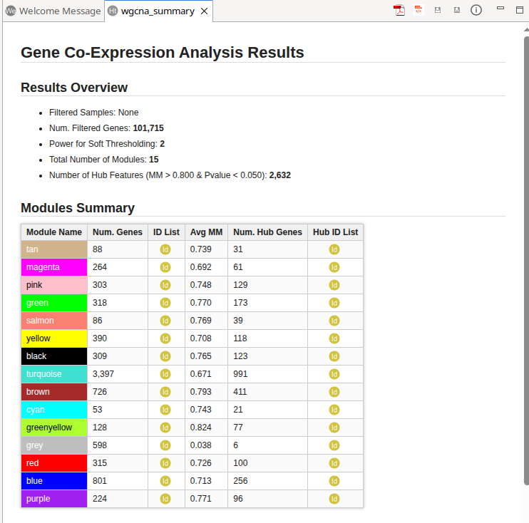
Figure 5. WGCNA Summary Report.
Set Hub Tag Thresholds
Updates the thresholds used to classify genes as hub genes. A gene is labeled as a hub gene if its Module Membership (MM) exceeds the specified threshold and its associated P-value is below the defined cutoff.
After the update, hub gene labels in the Main Viewer and the corresponding statistics in the Summary Report are automatically refreshed.
Fisher's Exact Test
Fisher’s Exact Test can be used to find GO terms that are over and under-represented in a set of genes (test set) with respect to a reference group (reference set). Fisher’s Exact Test uses a contingency table-based method to examine the association between two kinds of classification. There’s more information about the analysis and the parameters in the Fisher's Exact Test section.
With this tool, the subset of genes that will be considered as a Test-set will be the genes belonging to one or multiple modules, depending on the user input. The Reference-set will be all the remaining sequences in the dataset, that are also annotated in the functional annotation project, unless other configuration is specified.
- Test Module(s). The genes from the selected module(s) will be included in the test set.
- Test Hub Features Only. If checked, only features labeled with both the selected module tag(s) and the hub tag will be included in the test set.
- Remaining Genes. Use all the remaining genes present in the dataset as reference set, excluding genes in the test set. This is recommended for most analyses. If unchecked, select the reference module(s) manually with the parameter "Reference Module(s)".
- Reference Module(s). Available when Remaining Genes is disabled. Select the module(s) to include in the reference set. Reference modules cannot overlap with the test modules.
- Reference Annotation. Select a functional annotation file (.box or .annot) containing the annotation for the sequences.
- Two Tailed. Perform a two sided test means to test for over and under-representation i.e. test the test set against a reference ser and vice versa.
- Annotations. Select the annotation type(s) to use in the enrichment analysis.
- GO Categories. Select one or more GO categories to restrict the analysis.
Charts
Gene Variance Elbow Plot
The variability plot displays genes ranked by decreasing variability.
- The x-axis represents genes ordered from highest to lowest variability
- The y-axis shows the corresponding variability values.
Genes retained for the analysis are highlighted in green, and excluded genes are shown in grey.
As genes are ordered by variability, the curve typically shows a steep decline followed by a more gradual, flatter region. The “elbow” corresponds to the transition between these regions. Genes before this point exhibit high variability and contribute meaningful biological information, whereas genes beyond the elbow tend to have similar, low variability and add limited value to the analysis.
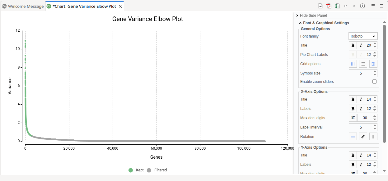
Figure 6. WGCNA Summary Report.
Soft Threshold Power
The Soft Threshold Power plot assists in selecting an appropriate soft-thresholding power for network construction (Figure 7). During the analysis, multiple power values are evaluated. For each tested power, WGCNA computes the Scale-Free Topology Fit Index (R²) and the Mean Connectivity.
- The x-axis represents the tested Power values.
- The R² (left y-axis) indicates how well the resulting network approximates a scale-free topology. Biological networks often exhibit scale-free properties, where a small number of genes (hubs) show many connections, while most genes have fewer connections. Higher R² values reflect a better fit to this expected topology.
- The Mean Connectivity (right y-axis) measures the average number of connections per gene. As the power increases, weak correlations are increasingly suppressed, typically reducing overall connectivity.
A suitable Power value balances two factors:
- A high R², indicating good scale-free topology fit
- A reasonable Mean Connectivity, avoiding an overly sparse network
In practice, the selected Power is usually the lowest value at which the R² curve reaches a high level (commonly ≥ 0.85) or begins to plateau. The dashed grey line marks the R² 0.85 value. Choosing the smallest power that satisfies this criterion helps preserve meaningful biological relationships while reducing noise.
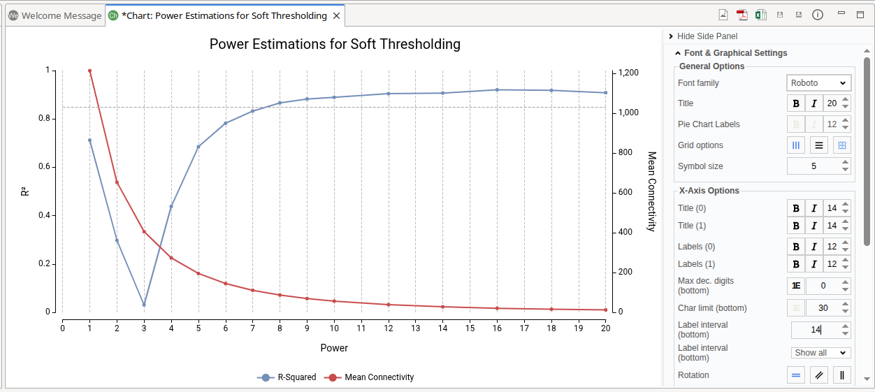
Figure 7. Scale-Free Topology Fit Index (R²) and Mean Connectivity for different Power values used for network soft-thresholding.
Modules Correlation
The Modules Correlation plot visualizes the direction and statistical strength of correlations between detected modules (Figure 8). Both the x-axis and y-axis represent the identified modules.
Each bubble represents the correlation between a pair of modules:
- Color indicates the correlation coefficient.Values closer to +1 (red) represent stronger positive correlations, while values closer to –1 (blue) represent stronger negative correlations. Values near 0 indicate weak or no correlation.
- Bubble size reflects the statistical significance of the correlation, calculated with a Sigmoid formula, function of the p-value (see below info panel for a more detailed description). Larger bubbles indicate more significant correlations.
The color range and maximum and minimum sizes of the bubbles can be configured on the plot's Side Panel.
Positive correlations are generally more biologically meaningful and easier to interpret. Modules with positive correlations tend to share similar expression patterns, suggesting coordinated biological activity, related pathways, or common regulatory mechanisms. Negative correlations may also provide insights but are often more complex to interpret biologically.
Only one half of the correlation matrix is displayed. Redundant module pairs are omitted, and self-correlations along the diagonal are not shown.
The correlation values are computed using the method selected in the Correlation Statistic parameter during analysis configuration.
Figure 8. Modules Correlation Plot.
Bubble size (p-value → bubble size)
The bubble size is computed from the p-value using a sigmoid (logistic) function that maps statistical significance into a bounded size range. This improves visual discrimination between non-significant and significant correlations by producing a marked increase around the conventional threshold (p = 0.05) while capping very small p-values so they do not dominate the plot. The mapping uses the following formula:
where
- \(M\) is the maximum bubble size.
- \(s\) is the sigmoid steepness (default in the implementation: \(5.0\)).
- \(t\) is the threshold offset (default \(\approx 1.301\), corresponding to \(p=0.05\)).
- \(x = -\log_{10}(p)\).
Edge cases: if \(p \le 0\) the size is set to \(M\), and if \(p \ge 1\) the size is set to the minimum bubble size.
Examples (illustrative values of Sigmoid(p)):
| P-value | Sigmoid(P-value) |
|---|---|
| 1 | 0.04 |
| 0.5 | 0.2 |
| 0.1 | 5.45 |
| 0.05 | 15 |
| 0.005 | 29.8 |
| 5.00E-06 | 30 |
| 5E-18 | 30 |
| 5E-35 | 30 |
The examples above are generated with \(M=30\), \(s=5.0\), and \(t\approx 1.301\) to illustrate the behaviour: a small jump near \(p=0.05\), increasing sizes for more significant p-values, and a saturation that prevents extremely small p-values from making other bubbles visually unrecognisable.
Gene Network
The Gene Network plot visualizes the co-expression relationships of the specified gene (Figure 9). It generates a gene network showing only the connections to the specified gene that pass the filtering criteria.
- Gene. Write the gene to visualize in the text box. The search autocompletes as the user types.
- Min. Connectivity. Defines the minimum connection strength required for edges to be included. Connections below this threshold are excluded, allowing the visualization to focus on stronger gene–gene relationships.
- Min. MM. Defines the minimum Module Membership (MM) required for genes to be displayed. Genes with MM values below this threshold are excluded, restricting the network to genes strongly associated with their assigned module.
The generated network plot has the following characteristics: * Hub genes are highlighted using a diamond symbol. * Non-hub genes are displayed using circle symbols. * Node size is proportional to Module Membership (MM), where larger nodes indicate stronger association with the module. * Edge width reflects connection strength, with thicker edges representing stronger co-expression relationships. * Node color indicates module assignment.
Network Side Panel
The network visualization can be configured on its Side Panel.
- Adjustments. Adjust filters to show/hide nodes and edges.
- Series. Change the nodes appearance. Change the symbol of the different categories, the module colors, and adjust the nodes border color and width.
- Graph Settings. Change the network appearance. Adjust the repulsion between nodes, the edge lengths, the size of the nodes, edges, and gene labels, etc.
- Font & Graphical Settings. Adjust the font, and show/hide the gene labels with the "Enable floating labels" option.
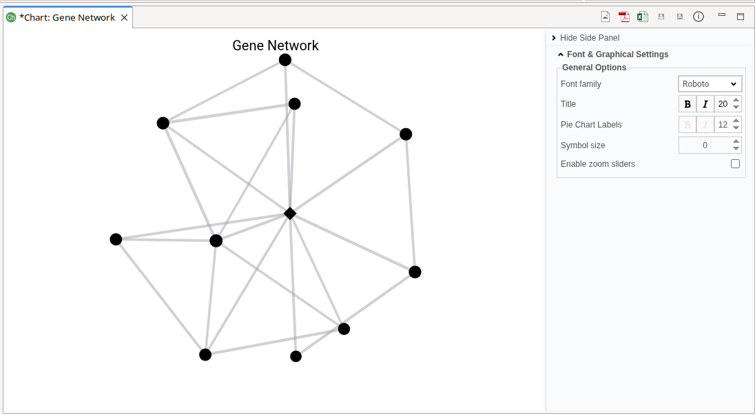
Figure 9. Gene Network.
Module(s) Network
The Module(s) Network plot visualizes the co-expression network of genes belonging to the selected modules (Figure 10). This plot behaves similarly to the Gene Network plot, with module-based selection instead of gene-based input.
- Module(s) to Plot. Select one or more modules to visualize. Genes assigned to the selected modules will be included, if they meet the filtering criteria defined with the parameters below.
- Min. Connectivity. Defines the minimum connection strength required for edges to be included. Weak connections are excluded from the visualization.
- Min. MM. Defines the minimum Module Membership (MM) required for genes to be displayed. Genes below this threshold are excluded.
The generated network plot has the following characteristics: * Hub genes are highlighted using a diamond symbol. * Non-hub genes are displayed using circle symbols. * Node size reflects Module Membership (MM). * Edge width represents connection strength. * Node color indicates module assignment.
Network Side Panel
The network visualization can be configured on its Side Panel.
- Adjustments. Adjust filters to show/hide nodes and edges.
- Series. Change the nodes appearance. Change the symbol of the different categories, the module colors, and adjust the nodes border color and width.
- Graph Settings. Change the network appearance. Adjust the repulsion between nodes, the edge lengths, the size of the nodes, edges, and gene labels, etc.
- Font & Graphical Settings. Adjust the font, and show/hide the gene labels with the "Enable floating labels" option.
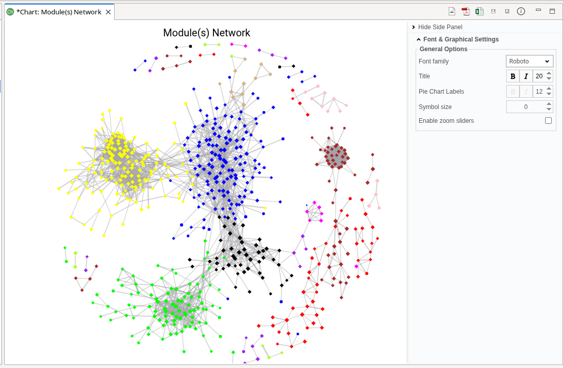
Figure 10. Modules Network.
Module-Trait Correlation
The Module–Trait Correlation plot visualizes the relationship between detected modules and experimental conditions, along with the strength of those associations (Figure 11). This plot is available only when an experimental design has been provided and for the factors selected for testing.
- The y-axis represents experimental conditions or traits.
- The x-axis represents detected modules.
- Each bubble represents the correlation between a module and an experimental condition:
- Color indicates the correlation coefficient. Values closer to +1 (red) represent strong positive correlations, while values closer to –1 (blue) represent strong negative correlations. Values near 0 indicate weak or no correlation.
- Bubble size reflects the magnitude of the correlation. Larger bubbles indicate stronger correlations. The size is calculated with a Sigmoid formula, function of the p-value (see above info panel for a more detailed description)
The color scale and the minimum and maximum bubble sizes can be adjusted in the Module Size Panel.
This visualization helps identify modules associated with specific biological or experimental variables.
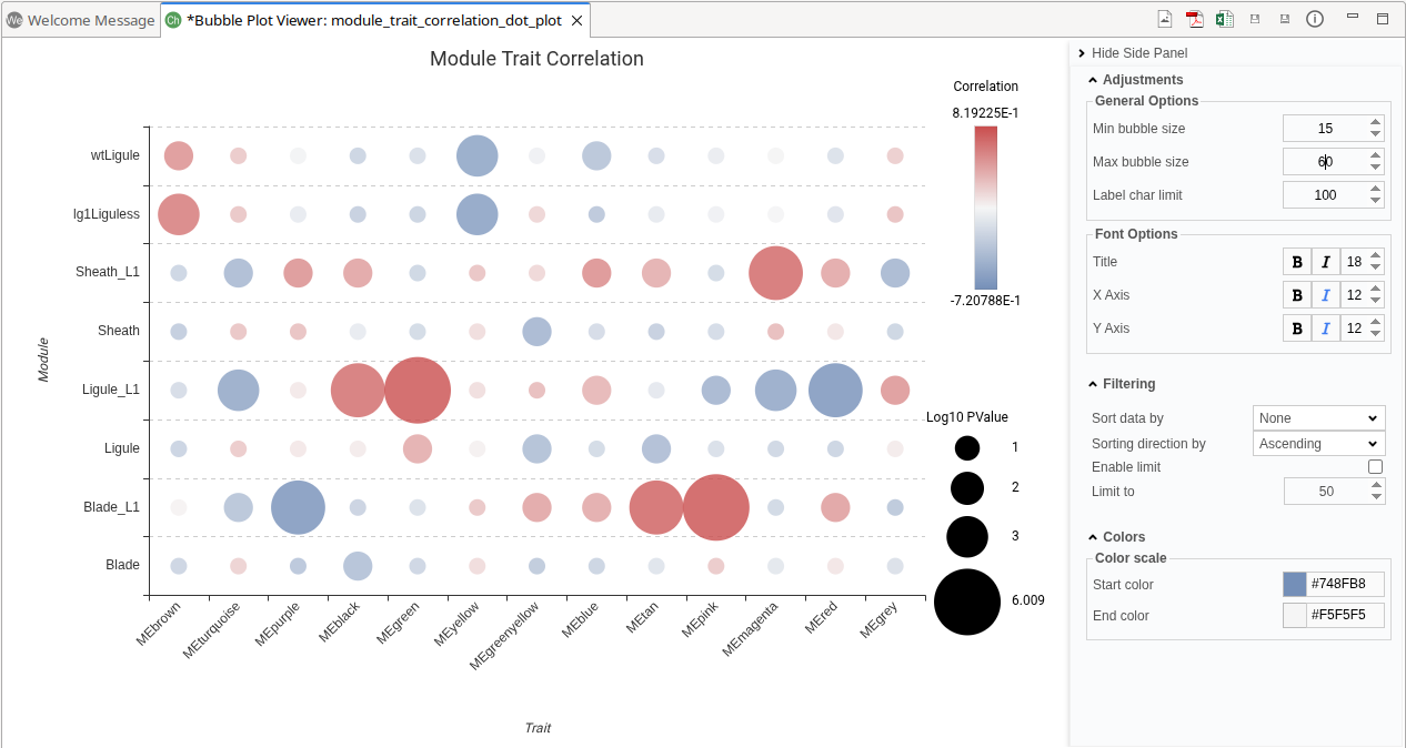
Figure 11. Module-Trait Correlaition Plot.
Heatmap
The Heatmap plot visualizes gene expression patterns across samples using either raw or transformed expression values (Figure 12).
- Select Features. Defines how genes are selected for visualization.
- Module(s): Select one or more modules. Genes assigned to the selected modules will be included.
- ID List: Provide a custom list of gene IDs to visualize.
- Module(s) to Plot. Available when Module(s) is selected. Choose the modules whose genes will be displayed.
- ID List. Available when ID List is selected. Specify the file containing the gene identifiers.
- Expression Data. Select the expression values to display: Count Per Million (CPM) or Raw Counts.
- Logarithm. Applies a log2 transformation to the expression values.
- Z-score. Standardizes expression values by converting them to z-scores. The z-score represents how many standard deviations a value deviates from the mean expression of the gene.
By default, OmicsBox applies CPM normalization, log2 transformation, and z-score standardization. These transformations improve visualization by making expression values comparable across genes. Raw counts often vary widely between genes, which can obscure meaningful patterns. CPM normalization accounts for library size differences, log transformation reduces the impact of extreme values, and z-score standardization highlights relative expression changes. Together, these steps enhance the detection of expression trends, clusters, and module-specific patterns.
The heatmap displays gene expression patterns across samples. This visualization enables the identification of expression trends, sample similarities, and gene clusters.
Columns represent samples and rows represent genes. Genes and samples are ordered according to hierarchical clustering, shown as dendrograms. This arrangement groups together genes and samples with similar expression profiles, facilitating pattern recognition.
Color indicates the expression level, with dark red representing higher expression values and dark green lower expression values. The minimum and maximum values depend on the selected data transformation (CPM, log transformation, and/or z-score). The color scale can be adjusted in the Heatmap Side Panel.
Additional customizations options are available, including: show or hide dendrograms, display or hide expression values within cells, etc.
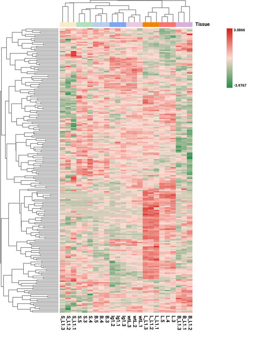
Figure 12. Heatmap showing transformed gene (rows) expression values across samples (columns).
Export
Export Table
Export the results shown in the Main Viewer to a text file with columns separated by tab.
Context Menu
Apart from the generic Context Menu options, the WGCNA results have the specific tools explained below.
Plot Gene Network
It performs a Gene Network providing as input gene list the genes from the selected row(s).
OmicsBox Engine
This tool can be run from the command line via the OmicsBox Engine.
Command: omicsbox wgcna [options]
Input constraint: provide one or more of:
--i-count-table,--i-count-table-file.
Inputs
| Flag | Type | Required | Description |
|---|---|---|---|
--i-input-counts |
file | Yes | Count Table File |
--i-design-file |
file | Yes | Experimental Design File |
--i-count-table |
file | Yes | Count Table (.box, or plain file) |
--i-count-table-file |
file | Yes | Count Table as a plain text file (.txt/.tsv/.csv) |
Parameters
| Flag | Type | Default | Range / Candidates | Required | Description |
|---|---|---|---|---|---|
--provide-exp-design |
boolean | true | No | Provide Experimental Design | |
--factors-to-test |
enum (multiple) | undefined | undefined |
No | Factors to Test |
--variable-genes-method |
enum | manual | manualelbow |
No | High Variable Genes Method |
--n-hvg |
integer | 10000 | ≥ 0 | No | N. High Variable Genes |
--min-genes |
integer | 100 | ≥ 0 | No | Minimum Genes |
--soft-thresh-method |
enum | auto | automanual |
No | Power Calculation |
--soft-thresh |
integer | 1 | ≤ 30 | No | Power for Soft Threshold |
--cor-type |
enum | pearson | pearsonbicor |
No | Network Correlation Statistic |
--deep-split |
enum | 2 | 01234 |
No | Module Detection Sensitivity |
--detect-cut-height |
double | 0.95 | 0.0 – 1.0 | No | Detect Cut Height |
--merge-cut-height |
double | 0.15 | 0.0 – 1.0 | No | Merge Cut Height |
--min-core-kme |
double | 0.5 | 0.0 – 1.0 | No | Min Module Connectivity |
--min-core-kmesize |
integer | 20 | ≥ 1 | No | Min N. Genes with Min Connectivity |
--min-module-size |
integer | 30 | ≥ 1 | No | Minimum Module Size |
--network-threshold |
double | 0.5 | 0.0 – 1.0 | No | Network Edge Threshold |
--correlation |
enum | pearson | pearsonkendallspearman |
No | Correlation Statistic |
--delimiter |
enum | tab | tabspacecommasemicolon |
No | |
--na-treatment |
enum | skip | skipzero |
No |
Parameter relationships
| Flag | When | Effect | Affected flags |
|---|---|---|---|
--provide-exp-design |
false |
disables | --i-design-file, --factors-to-test |
--variable-genes-method |
elbow |
disables | --n-hvg |
--soft-thresh-method |
manual |
enables | --soft-thresh |
Global options (
--local-folder,--cloud-folder,--output-format,--config,--detach,--verbose, …) are shared by every Engine tool and are not repeated here — see the OmicsBox Engine reference.