Comparative Analysis
Introduction
This section explains the tools for the comparison of identified OTUs and functional annotation compositions between samples.
The first two tools, Sample Comparison Chart and Sample Comparison GO Graph, are visual and allow you to compare function abundances between samples. GO Slim generalizes GO annotations to make them comparable.
OmicsBox also provides two differential abundance tests:
- Differential Abundance Analysis of Taxa: identifies over and underrepresented OTUs between samples and conditions with the help of edgeR, a Bioconductor package in R.
- Differential Abundance Analysis of Functions: detects Pfam or EggNOG functional annotations that are enriched between two different environmental conditions.
Sample Comparison
Sample Comparison Chart
This feature helps to compare annotations between different samples with distribution charts. It also helps to compare GO annotations from EggNOG and PfamScan, or other tools, for the same sample. First, the different samples have to be selected. It is also possible to load external annotations through File > Load > Load Metagenomic GO Annotations and to load them here (Figure 1).
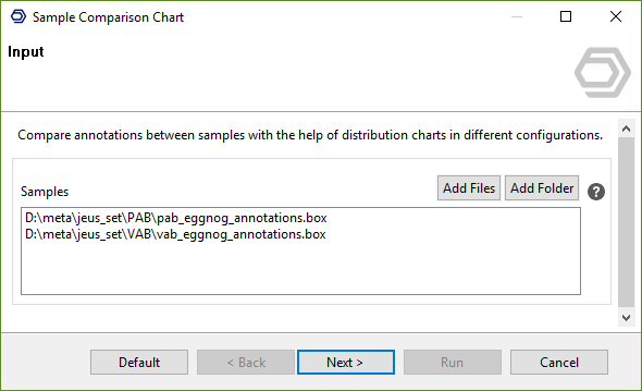
Figure 1. Sample comparison charts: input data page.
The second wizard page allows configuring the distribution chart (Figure 2).
- Columns to Compare: Only annotations that exist in all selected datasets can be selected here.
- Normalize Counts: In most cases normalizing the counts between 0 and 1 gives better results, because sample sizes are seldom equal.
- GO Categories: Create charts for each of the 3 main GO categories.
- Propagation of GO Terms: The GO hierarchy is reflected in the resulting chart and helps to compare less and more specific GO annotations at higher levels.
- GO Level Filter: GOs at higher levels are represented in higher numbers if propagation is enabled. This option makes it possible to focus on specific levels.
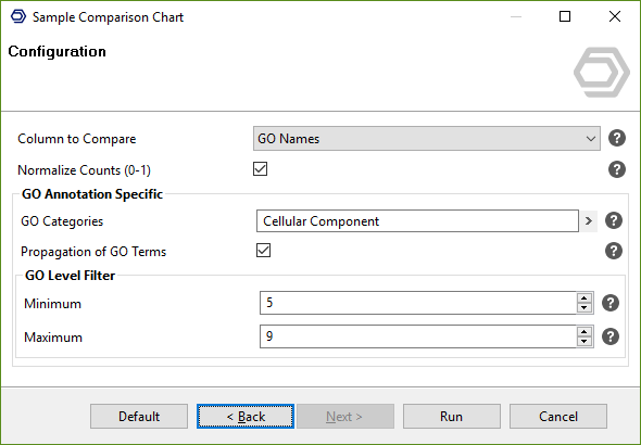
Figure 2. Configuration page.
On the right, the comparison of two different samples, both annotated with EggNOG Mapper, is shown. Cellular Component GO levels from 5 and lower are shown, ordered by maximum difference. The graphic visualizes that the red sample has major activity in intracellular parts and external encapsulating structures, while the blue sample works in different parts of the cell.
The graphic can be plotted as vertical or horizontal bars, lines, or area charts. Samples can be included or excluded, their colors can be changed, as well as their labels. The remaining options are self-explaining (Figure 3).
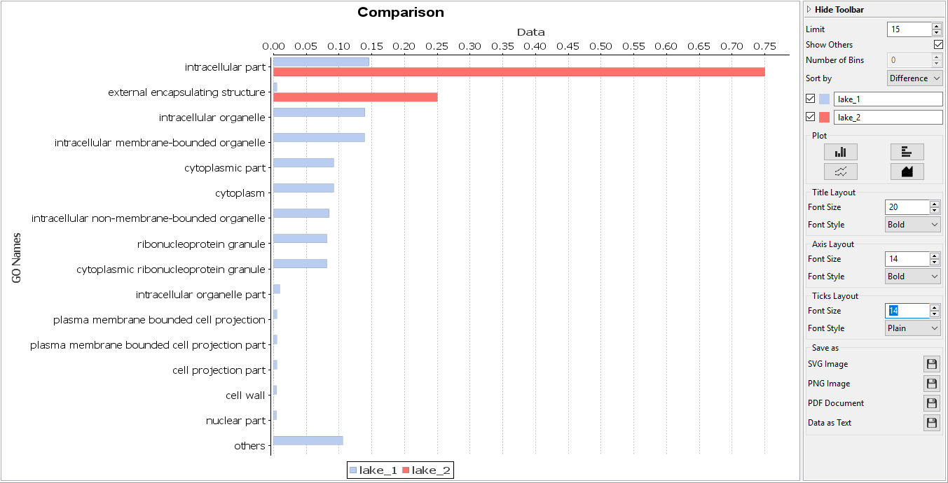
Figure 3. Sample comparison GO chart.
Sample Comparison GO Graph
The colored GO graph on the right side visualizes the same data as above. Only GOs that appear in both samples are shown (Sample Filter = 2). The graph nodes are colored with different areas for each sample. The area's sizes depend on the relative counts (Figure 4).
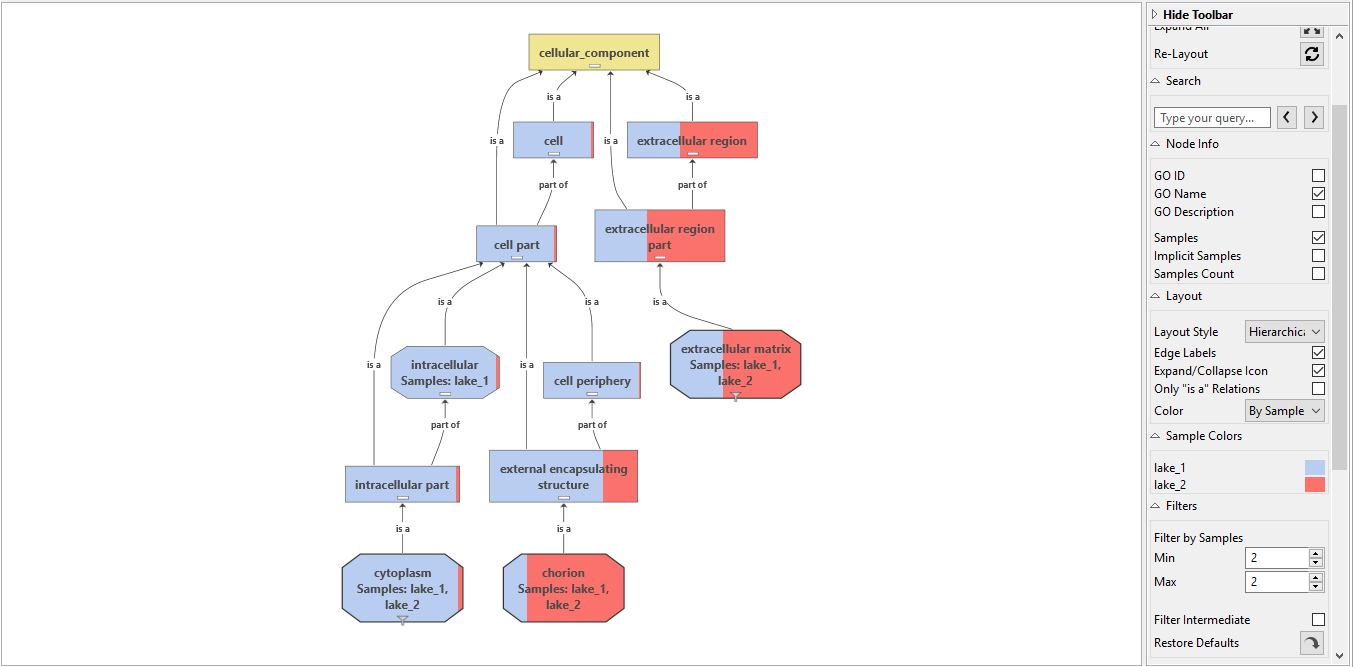
Figure 4. Sample comparison GO graph.
GO Slim
GO Slim is a reduced version of the Gene Ontology that contains a selected number of relevant GOs. More specifically, GO annotations are generalized and lifted up in the hierarchy. This can be seen as a way to normalize GO annotations to simplify comparison between samples.